Tuesday, March 31, 2009

Chapter 9: Science

I found the information discussed in chapter nine particularly interesting, especially because I’d never really given the subject of science photography and science as a visual art form. I suppose I’ve heard the term that science is art before, especially in terms of things like pictures that are from space and the like, but never specifically in terms of the human body and science.

I’ve always, perhaps incorrectly, thought of art as art and science and science. Sometimes art may encompass such elements from science – many famous artworks often encompass the human form (I think of the statue of David, specifically). But in my mind I had classified the focus on the human form as the subheading under the giant umbrella of art, rather than the other way around.

What I find most interesting about using drawing art from science is how it’s such an ethical art. Art, in my mind, is meant to make you think and invoke some sort of emotional response, but never before have I thought about the moral and ethical repercussions. Often the emotional response is a call to action. Images like “race has no gene” plays on people’s guilt and prejudices. But images like those of true human dissections seem a bit more real. Images from the Visual Human Project seem a bit more graphic and real, even inescapable.


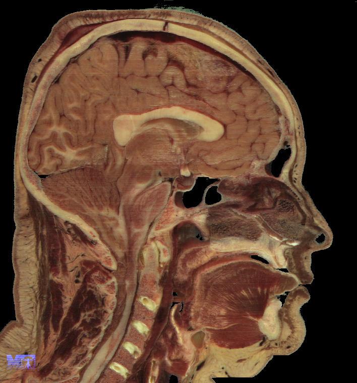
The beginning of the look at the body and science as art had a large boom during the period of renaissance art. One of the most famous was Da Vinci’s Vitruvian Man, which described the proportions of man based on geometic shapes and figures. This print is actually so famous and well known, that other artists have done mock prints with similar and pop culture symbols.


Recently though, the display of the body has become more of an ethical debate. The famous Body Worlds exhibition displays real bodies that have been preserved in plastic. The Body Worlds exhibit as well as the Visual Human Project has the effect of employing the abject in people – making it possible for people to see themselves in the art and thus invoking a sense of disgust and uncomfort. Though science has the ability to use art in order to teach future generations, it has also been met with great adversity and disgust.

Tuesday, March 24, 2009

Post Modernism and Indie

Out of chapter 8, what I found the most exciting topic was the progression of the video industry and the focus on post-modern themes. Having just finished a massive (rough) draft on the progression of video games and how they've adapted to the times, so caught my eye in the terms of film.

In 1988 Katsuhiro Otomo released his animated film, Akira. Akira, to those that know anything about the anime or japanese animantion pop culture, is one of those indie, cult films that is almost a requirement to see (think of it as akin to today's Boondock Saints). The theme of the movie is that a nuclear explosion has erupted in Tokyo, leaving the world crumbled and desolate in it's wake. From the rubble, however, comes the Neo-Tokyo in the age 2019.

Akira was an international cult success -- due not only to the underground popularity in anime, but also because of the cell animation, and the broad reach it had to adult audiences of the science fiction genre. According to the book, Akira demonstrates that "we do not live in a fully postmodern world but in a world in which postmodernity is lived in the crumbling ruins of modernity...through these films, viewers engage with simulated environments with the jaded sense that we know what is to come and that our bodies may be physically malleable and changeable through technology and medicine."


Following the Akira phase came things such as CGI animated films like Toy Story and A Bug's Life. What's interesting about these films, however, is the intertextuality within the films. Films, now, are hardly ever based on an original concept. Scenes in Shrek obviously had tones carried from the Matrix series that proceeded it, just as Aladdin had references to Julius Caesar with "et tu, Brute?" I had known about intertetuality in terms of novels and stories, but had never applied the concept to film.

Helvetica

Though I felt like an absolute dork while doing so, I enjoyed watching the movie Helvetica. Being an English major that has a heavy sense of design (I've been working on some sort of school publication since I was a sophomore in high school) and I thought I was strange for noticing the peculiarities of fonts. I absolutely hate papyrus, as I think anyone that ever wanted a default "asian-looking" font resorts to that. Ironically, I always hated Arial for bulk-text as well; it was ironic then, to discover that Arial was just window's version of Helvetica.

I found it odd how everyone gushed about how amazing the font was; yes, I agree that Helvetica is very nice and neat, but by the same token I feel as if the font lacks any sort of emotion...at all. You cannot call it professional looking, whimsical, curly, bubbly, exciting or any sort of other defining word. It is simply...there. That's why I agree that Helvetica is good to have in places such as stop signs or trash can bins. You don't need Edwardian Script to say "Stop" or "Place trash here." Overall, however, I enjoy a bit of life and design within my fonts, and I think that a font should describe what you are selling. If you are to be whimsical, shouldn't your title (name AND font) describe that? There is such versatility to font faces, it seems a shame to focus so heavily on one. If you notice, my blog is not written in Arial/Helvetica. I feel like those fonts say nothing about me.


Tuesday, March 3, 2009

Advertising

Few things in terms of digital media I find as interesting as advertising. You can’t manage to drive to the grocery story without being bombarded by advertisements on billboards and on the radio.

Thought it was not the largest part of the chapter, what chapter 7 made me think about the most was the branding associated with advertising. We started to discuss the same topic in one of my other classes, so perhaps that’s why this topic was at the forefront of my mind. Why is it that so many people associate themselves not with a product but with a product name? No one listens to MP3 players anymore, but instead they’re always listening to iPods. Other brands often model their own products after those things that have done well. There are even AM/FM radios that have gotten an extreme make over to look like the iPod.


What is it that makes a product so appealing to the masses and catch on in the market? The following graphic seems to prove it the best. It’s a delicate mix of what you’re good at, what your competitors are bad at, and what it is the masses are craving for – this is not a surefire way to success, but it does help to be a bit above the curve. When CDs where the new and improved way to play music media, Sony was at the top of the curve; but when music turned completely digital, it was the apple company that skyrocketed to the top. They saw the market and supplied a product that their masses wanted and competitors could not yet supply.


Lastly, this entire chapter reminded me of the 2005 commercial for Starbucks Espresso shots. The catchy jingle (a common marketing tool) made sure that I would never be able to forget their product.